During the process I used a huge array of different media technologies to help produce our final three products.
 |
During the research and planning stages, I looked at many different artwork comparisons using powerpoint which enabled me to understand why artists use a variance of album artwork styles depending on their genre. This helped me later on when designing the digipack as I was able to reflect on the variance that I had learnt.
YouTube
At the beginning of the process I used the internet and YouTube to help me find tracks that I would be interested in making for my project. I researched songs that I was keen on producing a video which ultimately led to me finding three songs that I believed would create a good video. This technology enabled me to find artists that I hadn't heard of, as well as well known artists, which gave me inspiration to think of other artists and songs that may fit. I was keen on finding a song with a good beat and something that did not have a video to the track already, so our video would not be compared to that. I wanted my music video to be completely unique and individual so finding a lesser known track was vital to me. I was able to search 'bass tracks' which led to over 1 million results that had a link to that which was a useful function. From the ability to scroll through all of these tracks, I was able to find three tracks that I wanted to create a video for. However, for the majority of these tracks, I found these from 'related videos' which also widened my search to finding a great song.
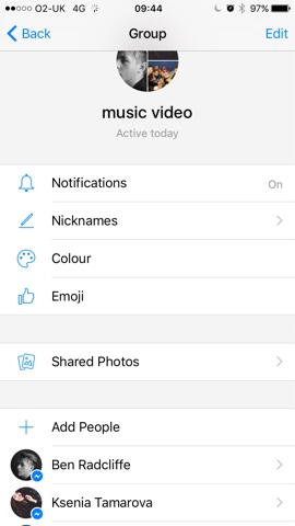
 In addition to powerpoint, I used Facebook Messenger and emailing in the research and planning which enabled our group to stay in contact when planning to shoot our video. For example we talked about planning our props and costumes over FB Messenger which was exceptionally useful for quick and easy communication.
Test Shoot
We shot the test shoot using an iPhone 5s which was a great piece of technology as it enabled us to quickly and easily upload our footage to our editing software which was Final Cut Pro X where we edited the software. We were able to edit our test shoot using the footage we captured. However, we were unable to get Josh and Gracie for the test shoot so we cut in videos of Josh on YouTube to the video. Due to the ease of creating the video, we were able to have a look at a rough idea of how our video would look if we went with the ideas we had at the time, therefore enabling us the opportunity to change what we didn't like.
From doing the test shoot, I learnt that we needed to include more of the dance as this was the most interesting thing about the test shoot as well and to incorporate the dance and the narrative together which would create a more compelling video. We used this to develop our plans for the actual video itself by speaking to our dancers about how we can choreograph a dance which conveys a broken love story due to the main lyric of the song 'the lovers that went wrong' and therefore we came up with a beautiful dance that told a story as well as being great to watch.
The test shoot gave us a look at how the visuals would fit with the music track which was vital to see if the visuals would flow. The test shoot shows how the dancing looks fantastic with the music which was reassuring and therefore we needed to bring the other two strands up to this level by increasing the art direction for the performance and collaborating the dance and the narrative.

Production
During the production stage we used two types of camera due to our two shoot days. We used a Canon 5D for the London shoot of the dancers and a Sony FS100 for the shoot of the singing.
We used a 50mm 1.4 aperture which created a narrow depth of field for our dancers. This made the dance look epic filmic and beautiful which contrasts with the track. We had the ISO set to 100 and had the shutter speed set to 60 which is close to the standard settings. The colour temperature that the 5D set itself too on the day of the shoot was 5600, however we decided to manually change this to 4800 so the 5D thought it was a warmer day and therefore making the images look colder. We did this due to the urban surrounding with cold concrete and the open locations creating a resemblance to the track. We also used a shoulder rig, attached to the Canon 5D which helped us stabilise the camera to match the smooth and fluid dance.
 |
| Cold Colours |
 |
| 85mm lens to emphasise beauty |
 |
| Slow tracking shot |
Editing
The editing process was the stage where we were able to see the video coming together from the two shoot days. We edited on the software, Adobe Premier which is great editing platform and allows you to experiment with lots of different options and tools. We started with syncing all of the clips to the track by using the clapperboard that was shot at the beginning of each take. As Youth is a slow and beautiful song, we knew we wanted to cut on the beat to make it look seamless and thus the video wouldn't seem fragmented or unorganised. We wanted to create a music video where you the editing is noticed, but also enabling the viewer to focus on the narrative and the lyrics.
 |
| Noticeable editing - focusing on song lyric |
We also took proprietary advantage of graphic matching to match the shots from the two shoot days so the film would flow rather than look like two separate videos. We made sure we matched shots to similarity in their pictorial quality as well as using rhythmic editing to cut on the rhythm so, once again, the video would flow and, as a viewer, you would notice the editing and get lost in the narrative. This was formed by cutting much quicker near the end of the track as the rhythm gets faster. We used discontinuity editing to cut between locations and scenarios however we carefully cut the video so the audience are able to follow the narrative despite the rapid change of locations due to the dance reflecting the songs lyric. Finally, we used colour correction on Adobe Premier to give the footage a colder and realer look. Using the RGB (red, green, blue) balance enabled us to make the studio shots feel cooler and to match the other shots so we were sure that the exposure was correct. It was important that the two different strands (the performance and the dance) looked like the same video rather than two separate ones, and the colour grading allowed us to blend the colours so the temperature looked similar in both strands and therefore it made the video flow preventing distraction.
Syncing a clip:
 |
| Vetroscope- allowed precise colour correction keeping a perfect balance of levels |
 |
| Before colour grading |
 |
| After colour grading |
Digipack
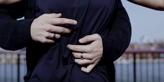
I used the software Lightroom to edit the pictures. It enabled me to experiment with colour and how the different pictures look from the shoot we shot on the Hurtwood hill. I did this by using the RGB edit as well as changing the grain and the exposure of each of the pictures. As you can see from the pictures below, I was able to transform this:
Into this:
After editing the shots on Lightroom, I then transferred them onto Photoshop where I was able to try putting text over the top of the pictures. I was sure that I wanted a picture with a large sky line so I was able to place the writing over it, one of the main reason for choosing and taking this picture. I used many different tools such as colour templates and grain changes to change the image so it would be more eye catching and individual.
Website
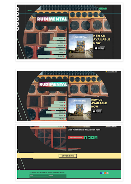
I experimented with both Wix and Wordpress by creating websites for Ed Sheeran and Rudimental.
Ed Sheeran website using Wordpress: https://edsheeranmax.wordpress.com/

Rudimental website using Wix: http://maxboast.wix.com/rudimental

I found Wix easier to use however Wordpress gave a more professional looking website. After much consideration we came to the conclusion to use Wix as we felt we would be able to create a better website for our indie folk band using that website.
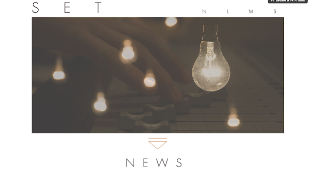
We used the software by first sorting out the tabs and the design. We knew we wanted a simple design so fans could easily navigate the website so we opted with a simplistic tab layout by just having the first letter of each word as the tab, such as N for News.
We incorporated many pictures that we took on our photoshoot and included them in the website to show fans how the band produce most of their music themselves and so fans can see what and how they do this. We produced a slideshow which is shown as soon as the website is launched.


No comments:
Post a Comment